May 11, 2014

Sigmar Polke at MoMA

Sigmar Polke at MoMA

I recently visited Sigmar Polke’s retrospective exhibition at MoMA. Without having any substantial knowledge of the artist or his work, I decided to take a deep jump into the pool of overwhelmingly filled galleries and hope to leave with at least a sense of the re-known 20th century post-war artist’s career or somewhat of an understanding of his artistic vision.  Identified as a multi-medium artist, Sigmar Polke’s work includes “painting, photography, film, sculpture, drawing, printmaking, television, performance, and stained glass.”[1] As I swam from gallery to gallery, I was immediately perplexed by the amount of all kinds of different art that covered their ceilings, walls, and floors.
Following the printed guide that includes a map of the exhibition with the labels for each piece of work, I attempted to make sense of the curatorial line for this retrospective. The more I saw, and read about Polke the more I realized the wide variety of materials, narratives, styles, and themes embedded in his work; it became obvious then that the curatorial decision for the organization of the exhibition was a chronological one rather than a stylistic one. Since I had come straight from our Curating Moving Images class, I was naturally drawn to specifically observe the films, and other moving images in the exhibition, and try to make sense of the curatorial decisions behind each of them.
In his review for this exhibition written in the New York Times, Holland Cotter writes about Polke as an artist whose wide range of work has always presented a challenge for curators due to the diversity of mediums, as well as the complexity and constantly evolving themes that make up his portfolio. He praises the work of the curators for this exhibition, which does not try to create a linear coherence or narrative of Polke’s work but instead they attempt to let the works speak for themselves respecting the artist’s lack of coherence and constancy throughout his career. He celebrates the curators’ decision to not use ‘object labels’ next to every work in the exhibition but “Instead, and this an excellent idea, they’ve designed a free, gallery-by-gallery, work-by-work checklist, a kind of Baedeker for the perplexed that incorporates some useful commentary. [2] 
After visiting the exhibition, there is no question that Polke is indeed an artist whose work presents an enormous challenge to curate, especially as a retrospective, mainly because most of the art is huge in size (specially the paintings), stylistically diverse, multi-faceted in subject matter, and in its use of mediums.
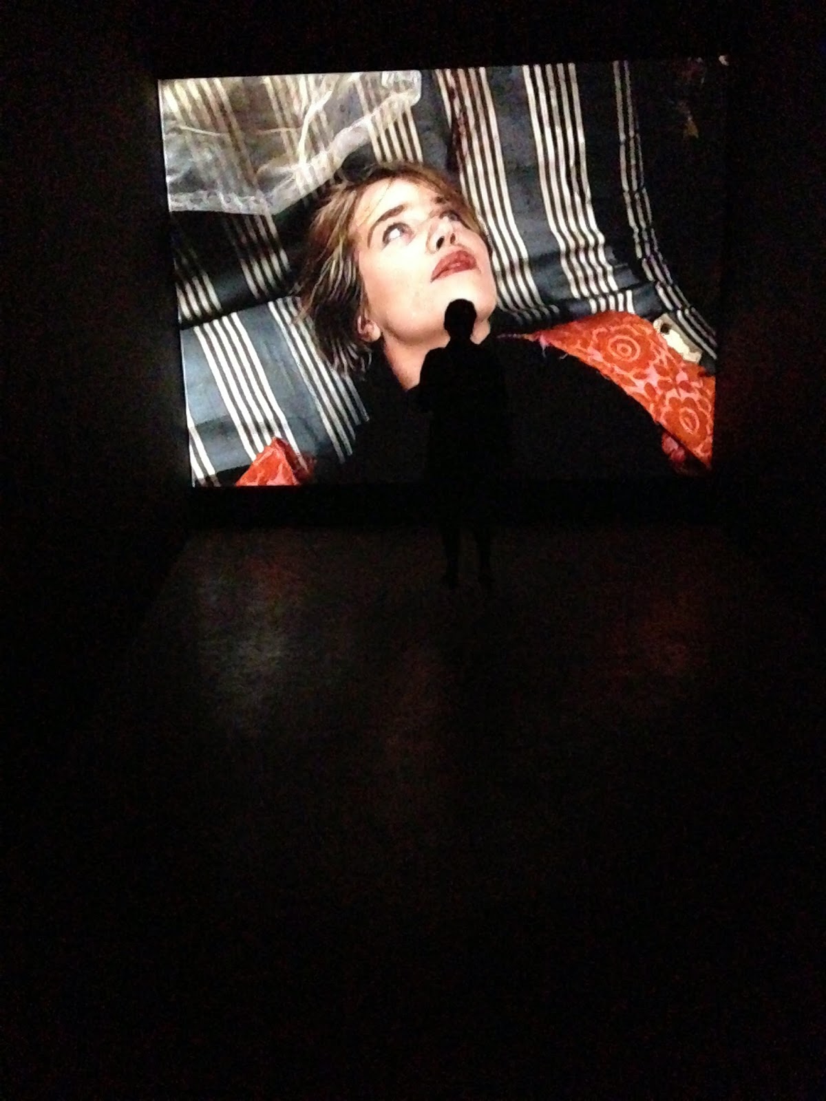
The overarching feeling that I experienced as I witnessed Polke’s five-decade career was that of overwhelming intrigue, frustration, and impatience. But when I had room to take a step back from the walls, a deep breath and be at a safe enough distance to carefully observe, with a careful consideration of the guide, I was able to truly appreciate some of the magnificent paintings, photographs, drawings, and printmaking that make-up the majority of Polke’s career. However, the films were sometimes projected in 16mm format against a hanging screen from a high point in between an entrance to a gallery, or played in television monitors on the floor situated in the deepest end of a gallery’s corner. Others were projected through HD projectors against a wall that served as a light passageway surrounded by paintings, and photographs. I noticed some of the projectors had a speaker hanging below them, but I was not able to hear the sound in most of these projections. The projection that surprised me the most was one that was shown on a screen that hung in between two walls that served as the entrance to a smaller gallery. I only noticed the screen on my way out and I stopped to look at it but it was hard to decipher the images from my point of view. Generally, the curatorial decisions behind the films were incoherent, and unclear.
I understand that every piece of work was a decision thoughtfully made by someone, so to form part of the retrospective, thus, a work is considered important enough to be shown properly, no matter the medium. Then, why are films ‘hung’ or exhibited in a way that seems less attentive, and considerate than per se, the paintings? Are the decisions to curate the films in a variety of ways following a specific style that the artist usually preferred for this chunk of his work? Judging from the lack of organization, and constancy in Polke’s work, I doubt that he had any specific set of instructions for the way his films should be projected. Then, it is the curators’ responsibility to convey the artist’s vision, yet, in a way that the quality of his work is not sacrificed. I saw no trace of the curators’ concern to aid the viewer in engaging with the films, as much as there is a concern for the photographs, and paintings in the exhibition.
There is no room to appreciate most of the moving images except for the few that are found in dark rooms with benches, projected at a reasonable height, or in a gallery with a light that is low enough to appreciate what is being projected. My favorite gallery, actually, included four slide projectors projecting on two colliding walls with a visually powerful painting next to them that resembled the characters in the distorted images that were being projected.
Overall, the work, and career of Polke is memorable, and engaging, and the exhibition at MoMA is a great place to see it, especially if you are curious about the complexity of curating art made by a wide variety of mediums, exhibited in a wide variety of spaces. Regardless of the unfortunate film curating decisions, the curators manage to creatively create an experience that is a reflection of Polke’s career and work, and provokes for an insightful time well spent.  

“Alibis: Sigmar Polke 1963-2010” opened on Saturday, April 19th and remains on view through Aug. 3 at the Museum of Modern Art.

In conjunction with the film exhibition there are a series of film screenings. You can find the schedule here: http://www.moma.org/visit/calendar/exhibitions/1407


[1] Kathy Halbreich, Alibis: Sigmar Polke 1963 – 2010, http://www.moma.org/interactives/exhibitions/2014/polke/

[2] Holland Cotter, Found Everything, Tried Everything, All His Own Way: A Sigmar Polke Retrospective Opens at MoMA, http://www.nytimes.com/2014/04/18/arts/design/a-sigmar-polke-retrospective-opens-at-moma.html?_r=0

Unusual Screens: Disney Imagineers are always hard at work . . .

Unusual Screens

by Katie Leary

Disney Imagineers are always hard at work developing new ways to entertain us. During my spring break visit to Disney World in Florida I took note of the many ways Disney manipulates moving images to create unique viewing experiences. There were two "screenings" in particular  that are worth thinking about further.

Within Epcot Attractions, Soarin' is a ride that originated in the west coast park Disney California Adventure.  Taking up the language of the movie theater, the movie is a montage of the diverse landscapes of California presented in IMAX format.  The auditorium shape and seating diverges drastically from a traditional movie theater. The seating is neither the familiar stadium nor standard theater seating.  Viewers are strapped into rows of  seats that hang from an apparatus which lifts audiences to the center of a domed/ convex screen.  As the moving image plays, the theater adapts to emphasize it. The seats tilt, cool air blows, and scents of oranges are pumped in.

In this example, the physical theater is an integral part of the experience of the movie. I have seen other IMAX films before, both the science museum programs and Hollywood blockbusters. I can easily conceive of watching these films in other formats, such as home viewing or academic screenings, without a great loss to the experience. However, if the moving image aspect of Soarin' were removed from the ride, it would be changed completely. Thinking about Soarin' has reminded me how important the space of viewing is important to the experience of reception.

The second example of unique screening tactics is the pre-fireworks moving image projection on Cinderella Castle, a production an announcer's voice says is entitled Celebrate the Magic. I have seen a variation of this technology during an earlier visit, but the most recent incarnation was particularly fascinating. Instead of a flat (or at minimum smooth screen), the 'screen' is a 3-dimensional building.

A sequence of vignettes related to Disney properties (characters, movies, stories) are projected. There is a main projection on the façade of the building, and there are two additional, but slightly truncated, projections centered on the corners of the building. Viewers standing anywhere in the front of the park can experience the show. At times the projections highlight the existing architecture, which is then manipulated based on the actions of the characters on screen. For example, Wreck-It Ralph breaks off castle bricks like an old-school video game. The experience is truly magical.

Here's one spectator's ten-minute home video recording of it:

"Disney Magic Kingdom NEW!! Lights Castle Show 2013 Cindirella [sic] Castle," ("Film by Josh"), posted Jan. 20, 2013, by Mr121brian121, http://www.youtube.com/watch?v=XlRJxHwPnEY.


Why bring these up in relation to curating? While I was enjoying spring break in the sun, I found myself thinking about how these experiences can be archived. Can they be curated in the future? These are extreme examples, but it really makes me think about how can we, as curators, ever recreate an experience. Further, with advances in technology including integration of moving images into other forms of public experience, what new challenges will curators be facing?

The Orphans 9 Filmography Team

On Friday, May 9, filmographers Ashley Morton (l), Cate Park (c), and Diana Ritter (r) worked all day on the Orphans 9 filmography and its many pages associated on the symposium's new WordPress blog.

The Filmography begins here:  http://wp.nyu.edu/orphanfilm/filmography9/. 

Work stopped at 6:00 pm for the Department of Cinema Studies Graduation Party, where the team enjoyed the well-earned rewards of a Mexican buffet.  


Meanwhile, the site continues to "build out," with content written by fellow Curating curators. See for example, the posting by Ben Turkus about the Digital Decay and Remobilization session at Orphans 9. He incorporates a review of the new Heidi Rae Cooley book, Finding Augusta and its companion Augusta App. 

http://wp.nyu.edu/orphanfilm/augusta/

See also the more fully illustrated edition of this essay, posted here: http://orphanfilmsymposium.blogspot.com/2014/05/the-strategic-value-of-heidi-rae.html 


Also on that Orphan Film Symposium blog:

• audio (32 minutes) of Thomas Elsaesser's keynote address, "The Poetics of Obsolescence,"
http://orphanfilmsymposium.blogspot.com/2014/05/listen-to-thomas-elsaesser-poetics-of.html

• and Maria Vinogradova's notes on the Soviet amateur film she screened at Orphans 9, On the Same Earth (1976).
http://orphanfilmsymposium.blogspot.com/2014/05/on-same-earth-pictures-of-west-more.html 

You can see where the filmographers' work combines with the symposiasts' contributions, as in this page with the detailed filmography of the Eastern Bloc Amateur Filmmaking session: http://wp.nyu.edu/orphanfilm/filmography9/categorized-filmography/eastern-bloc/.


Thanks, team. Let's keep on trucking. 

-- Dan Streible

May 8, 2014

A Brief Note on Pixar in Concert by Ashley Morton


Just posting a little something about Pixar in Concert because I keep thinking about it. My guess is that the event was so popular they will have to do it again sometime, and I suggest you try to go!

The concert began with a fanfare from Toy Story. There was a giant screen situated over the orchestra, that showed a mini montage from each film as the orchestra played selections from its score. My first impression when looking at the program was that they were starting off with a bang (Toy Story, Finding Nemo, Ratatouille right from the start) but maybe using all of their good stuff too soon (ending on Brave and Monster's University). I was so very wrong; the order of film scores was fantastic. The first half of the program was softer, with Wall-E in the middle, and ending with the tear-jerking opening of Up. The second half started with The Incredibles, jolting you back into the music and following with the swinging music of Monsters Inc. and Cars 2. I haven't seen Brave, but watching the montage and hearing the music (complete with bagpipes) made me want to. The evening was quite a success because I enjoyed even the scores of films I hadn't seen, and it drew attention to some impressive scores that we may have forgotten; everyone remembers Wall-E, but maybe not A Bug's Life.

Conducted by David Newman (Academy Award Nominee, son of nine-time Oscar winning composer Alfred Newman and relative of Pixar composers Randy Newman and Thomas Newman) the evening had brief interjections and he stumbled over descriptions of the films, discussed some of the challenges and steps in composing, and was clearly very proud of his Randy and Thomas's accomplishments and nominations (I believe the family has been nominated 100 times in total). The family dynamic was so appropriate for such a family-friendly event, and the pacing was done so well, and the films so entertaining, that, despite being surrounded by kids, the only sounds I ever heard from them were bursts of giggles (I admit it, I giggled too). I assume that by the second night he probably got the mini speeches together a bit more, and either way, it was still enjoyable to hear him speak, and the informality suited the fun of the whole night, which finished with an encore of "You've Got a Friend in Me." Overall, it was a fabulous evening, it made me go straight home and listen to more Disney and Pixar music--which is exactly what you want from a night with the New York Philharmonic.

May 6, 2014

Fwd: The Improbable Made Possible: Farewell from a Dying Star - Tuesday, May 13th at Anthology Film Archives

Interesting line-up (and provocative title/subtitle), 
curated by a one time MIAP student, incidentally.  


---------- Forwarded message ----------
Tuesday, May 13th at Anthology Film Archives
Lorenzo Gattorna <gattorenz@gmail.com>


THE IMPROBABLE MADE POSSIBLE

FAREWELL FROM A DYING STAR


Tuesday, May 13th at 7:30PM

Anthology Film Archives

32 Second Avenue

New York, NY 10003

$10 General Admission, $8 Students/Seniors


The latest segment of THE IMPROBABLE MADE POSSIBLE, a roaming series showcasing contemporary avant-garde cinema, 
FAREWELL FROM A DYING STAR attempts to make cinematic sense of direct observation and its wayfaring counterpart, speculative fiction.


This program marvels at mesmeric outlooks on place – as viewed by Chris Lynn in Baoying, China; Margaret Rorison in Baltimore, Maryland; and Brendan and Jeremy Smyth in Bali, Indonesia – and embraces the enigmatic materiality of celluloid as manifested in Marika Borgeson's sun print, Josh Lewis' vertical exposures, John Price's outdated film stocks, and Robert Schaller's handmade pinhole apparatus.

20th century histories are also affected in THE HANDEYE (BONE GHOSTS), which stages a very special séance between Robert Musil and Frans Anton Mesmer, and in PLACES WITH MEANING, which stresses a reverberating representation of the Microsoft font, Webdings.

Resonating throughout this program are the echo, as evoked by Emily Richardson, 
"that reflects the unheard elements present in the earth's atmosphere," and the projection, in the words of Toby Tatum, "of an improbable realm, stitched together from a kit of warring elements into a fantastic whole."

Curated by Lorenzo Gattorna, THE IMPROBABLE MADE POSSIBLE has previously made stops at Spectacle Theater, UnionDocs and Antimatter [Media Art].    


Josh Lewis DOUBT #2
Toby Tatum A WORLD ASSEMBLED
Emily Richardson REDSHIFT
Chris Lynn BAOYING WINDOW
Brendan and Jeremy Smyth DEATH SONGS & CAR BOMBS
Scott Fitzpatrick PLACES WITH MEANING
Margaret Rorison SCANSION
Anja Dornieden & Juan David González Monroy THE HANDEYE (BONE GHOSTS)

John Price SEA SERIES 9
Robert Schaller UNDER THE SHADOW OF MARCUS MOUNTAIN
James Sansing VERSES
Stefan Grabowski LONG WAY FROM HOME
John Price SEA SERIES 13
Mary Ancel THE BRIDGE
Marika Borgeson THE STARRY MESSENGER

Total running time: ca. 85 min.


For further information on FAREWELL FROM A DYING STAR:

For further information about THE IMPROBABLE MADE POSSIBLE:

May 3, 2014

Christoph Schlingensief Exhibit at PS1 by Ashley Morton

After the Cindy Keefer class, I decided to go find a film exhibition and walk around, and really focusing on how the exhibition was set up.
The exhibition I visited was at MoMA’s PS1. Currently, the museum is showing work created by Christoph Schlingensief (1960-2010), a German artist who worked in both film and theatre, as both a director and an actor.
            The exhibit begins on the third floor, and although you are aware that there is a best format to see the exhibit once you are inside it, it is not so clear where you should begin. Indeed, I actually visited the exhibition a few weeks ago and started with a part of it that is on the second floor, with very little context, since most of the exhibit is on the floor above. This time there was a sign that pointed to the “entrance” and a “no entrance” sign for the preferred exit, which would have been very helpful the first time.
The first thing you notice about the Schlingensief section of the museum is the noise. At first it is a bit jarring, there are a couple of films being projected on the walls with the volume way up, but, whether intentional or not, eventually the overlapping sound creates a sort of atmosphere that feels natural when looking at Schlingensief’s work. It also makes the gentle sustained hum of an organ in one specific room (which I will discuss later) all the more obvious and appreciated.
The exhibition is set up on two sides of the museum’s hall. The first side is a series of rooms, all done with white walls, but packed with information. Colored stills from his various projects cover the walls, so the white doesn’t feel stark, but rather helps make the color of the images pop. The photos are various sizes, and placed in no strict pattern. They are not framed images, but seem like stickers, flat on the wall; a less formal and more creative way of displaying them, that again helps their color and forms pop, drawing your attention to them, even more than the films themselves. The lighting is dimmer and warmer than other exhibitions in the museum, but still well lit. All of the tags are completely readable, without the font being too dark (which I sometimes find, when combined with harsh white lighting, creates a strange, 3D effect that can give me a headache).
Actual films are projected on portions of the walls, with “making ofs” and other informational films shown on smaller televisions jutting out from the wall (many of which have a chair seated in front of them so a viewer may sit and watch the film at length). These televised films cannot be heard the way the projected films are, rather they have subtitles, so that the passing viewer may read for a bit, and are also connected to headphones, so that one may listen if they choose to. There is clear designation between all of Schlingensief’s projects, with the titles in large text across the top of each new “section” but the hallway-esque room still has a sense of chaos and disorder (which, once you see his work, feels appropriate).
Each “room” feels themed; one discusses various films, one his theatrical projects, another his experience as a talk-show host (which includes a couch and chair set up, with televisions, so that the museum-goer may sit and feel like they are on a talk-show set. Much of Schlingensief’s work involved the integration of audience participation, so this setup is a nice addition, inviting you to become part of the “set”).
There are instances of bleeding from light sources, one projection is directly under an EXIT sign, giving it a slightly gruesome, Dracula, quality, but in general the museum has done a great job immersing you into this little world of a clearly highly creative man. Another room is devoted to his own pieces of what I might call installation art; one of which is an 18 screen piece, all showing different bits of filmed work (some original to this project, some taken from previous Schlingensief works) that do not tell a linear story. An entire wall is devoted to just these 18 screens, and his concept was that viewers use the images to make a narrative of their own. The tag quotes him as saying “the cinema is not the right place for this kind of film” and staring at all 18 screens at once, you can understand why.
            The best portions of the exhibit, in my opinion, are the rooms that really allow you to completely immerse yourself in Schlingensief’s creative world. In the first, you follow a hallway, lit by old fashioned lamps your grandmother would have, turn the corner and find his Animatograph piece; a structure on a revolving stage where you are invited to climb around, sign the “guestbook”, and interpret the work on your own. Schlingensief’s works, as I said before, were all about integrating the audience into the pieces. This piece was created to “break the separation between the art and the reviewer.” The structure is covered in what appear to be bird feathers, has various little rooms, some of which have films and projections themselves, and feels very violent and abrasive. (Perhaps I was just imagining the foul smell.) This room feels shockingly silent after the previous ones, and the low hum of the organ makes you feel like you need to be silent and move slowly throughout the work.
            My favorite room was the one on the second floor (which I actually visited first on my initial visit). On the wall is a brief description of the major films that Schlingensief created: the “Germany Trilogy” (100 Years of Adolf Hitler-The Last Hour in the Führerbunker, The German Chainsaw Massacre-The First Hour of the Reunification, and Terror 2000-Germany out of Control) as well as a fourth film, Please Love Austria. The description is clearly part of the art, for it has annotations handwritten from people like Tilda Swinton and Patti Smith, admirers and co-creators with Schlingensief. From around the corner you can hear screaming, and you wander down an entirely black, dark hall, (not going to lie—I was a little freaked the first time since I had no conception of the kind of art I was about to see) into a large space which contains four screens, all larger than garage doors, each playing one of the four films listed above, at full volume, and with subtitles. The four films are not playing in any particular way that I can see, they are looped, so the visitor never sees the same bits of each film playing at the same time. Each screen is down its own wide sort of section, allowing you to walk forward and focus on the one film visually, or stand directly in the middle and be surrounded by the violent noise and images.


            There are even more rooms to the exhibit, one room devoted to screening full Schlingensief films named Club 69, after the theater he opened to show his work. Outside the room is a list of the screening times, titles, and running times. There is also a room with four projections that is based on a piece Schlingensief himself created to show certain films in another way.
            This is obviously just a cursory glance at the exhibit, and I am not telling you too much about the actual content, because 1. It is hard to describe and 2. I so thoroughly enjoyed not knowing the first time I went, I don’t want to ruin that for you all, but I suggest you go check it out (NYU students get into the museum for free so you have nothing to lose even if it isn’t quite to your taste) if you are at all interested in seeing a somewhat eclectic exhibit, thick with images and information. If you need any sort of hint about the graphic nature of some of his images, consider the titles of his films. German Chainsaw Massacre is a pretty good clue.

May 1, 2014

about the Kinsey Institute films, access to, and uses of

Question:  What should the Kinsey Institute do with its films?

Read: Linda Williams, "‘White Slavery’ versus the Ethnography of ‘Sexworkers’: Women in Stag Films at the Kinsey Archive,” The Moving Image 5.2 (2006): 106-35.

Does withholding a study copy of the film called KKK Night Riders constitute a violation of principled archival practice? Or is the Kinsey Institute Film Archive justified in keeping some items in its collection out of circulation, or out of the possession of a esearcher? Who has the better argument, the scholar or the archivist? Should institutions put restrictions on access to some items and not others? What kind/s of access are possible? wise? How is the Kinsey different from other archives? Should curators and archivists make restrictions on a case-by-case basis, or is there a general principle or policy that should apply? Should some types of users be given special privileges, while other types of users are denied access? What other information about this case would you want to know before finalizing your side of the argument?

Prepare for a debate in which you either defend or refute this resolution:

Resolved: The Kinsey Institute for Research in Sex, Gender, and Reproduction at Indiana University should make the works in its Film Archive more accessible to researchers.

Prepare by not only reading the article, but clarifying for yourself the facts of the case. Build your arguments from those facts, as well as from general principles.

Williams ends her essay by asserting:

Scholars and students should be able to screen and study the history of stag films through the greater access to the Kinsey collection. It is no longer enough to be able to view stag films on Kinsey Institute premises at Indiana University in private screenings. The stag film heritage needs the collaboration of scholars and archivists to preserve and study a body of work that has been far too long neglected.
We will conclude by stepping out of debate mode to pose the question differently: Might “the collaboration of scholars and archivists” resolve the access dilemma? If so, what form should this collaboration take? What would it accomplish beyond simply giving access?

Finally, we will discuss a bigger issue: preservation. Since the Kinsey Institute Film Archive houses more than 4,000 films (not including video), what should it do with them? Come prepared to offer at least one idea for the director of the Kinsey Institute.

_____

Some links about the Kinsey Institute films, access to, and uses of:

* The Kinsey Institute Film Archive and access policies:

* The 5th Orphan Film Symposium, University of South Carolina, March 22-25, 2006
http://www.sc.edu/filmsymposium/Orphans_Sound/orphans.htm
Linda Williams (UC Berkeley) Porn Films in the Kinsey Institute and Elsewhere 
(includes Q&A)

* The 7th Orphan Film Symposium: Moving Pictures Around the World
Wednesday, April 7, 2010, opening program: Orphan Film Ist.
http://www.nyu.edu/orphanfilm/orphans7/wednesday.php
  introduction to [The Janitor] (ca. 1930, Kinsey Institute Film Archive)
Gustav Deutsch, introduction to Film ist. a Girl & a Gun (Gustav Deutsch, 2009)

* Orphans Midwest: Materiality and the Moving Image, Indiana University, September 26-28, 2013


Session: The Kinsey Institute Film Archive

Russell Sheaffer (Indiana U) introduction

Liana Zhou (Kinsey Institute, Director of Libraries and Archives) Research Opportunities and Institutional Challenges of Working with Stag Films

Joseph Slade (Ohio U) Stag Film Audiences and Strictly Union (1919)

Eric Schaefer (Emerson College) William Mishkin and The Orgy at Lil’s Place (1963)